Project
Setagaya Album
Client
Dontaku Records
Year
2025
Services
art direction, album artwork
01. Context
01. Context
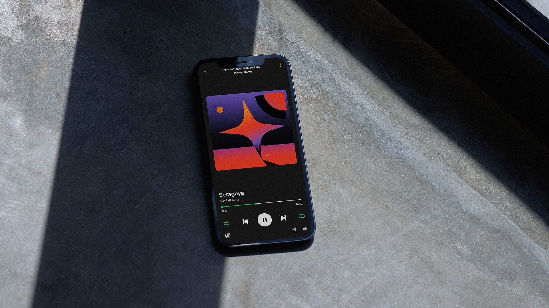
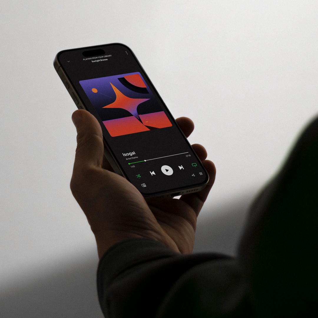
I was approached by Dontaku Records to do the visual direction for their album cover project.
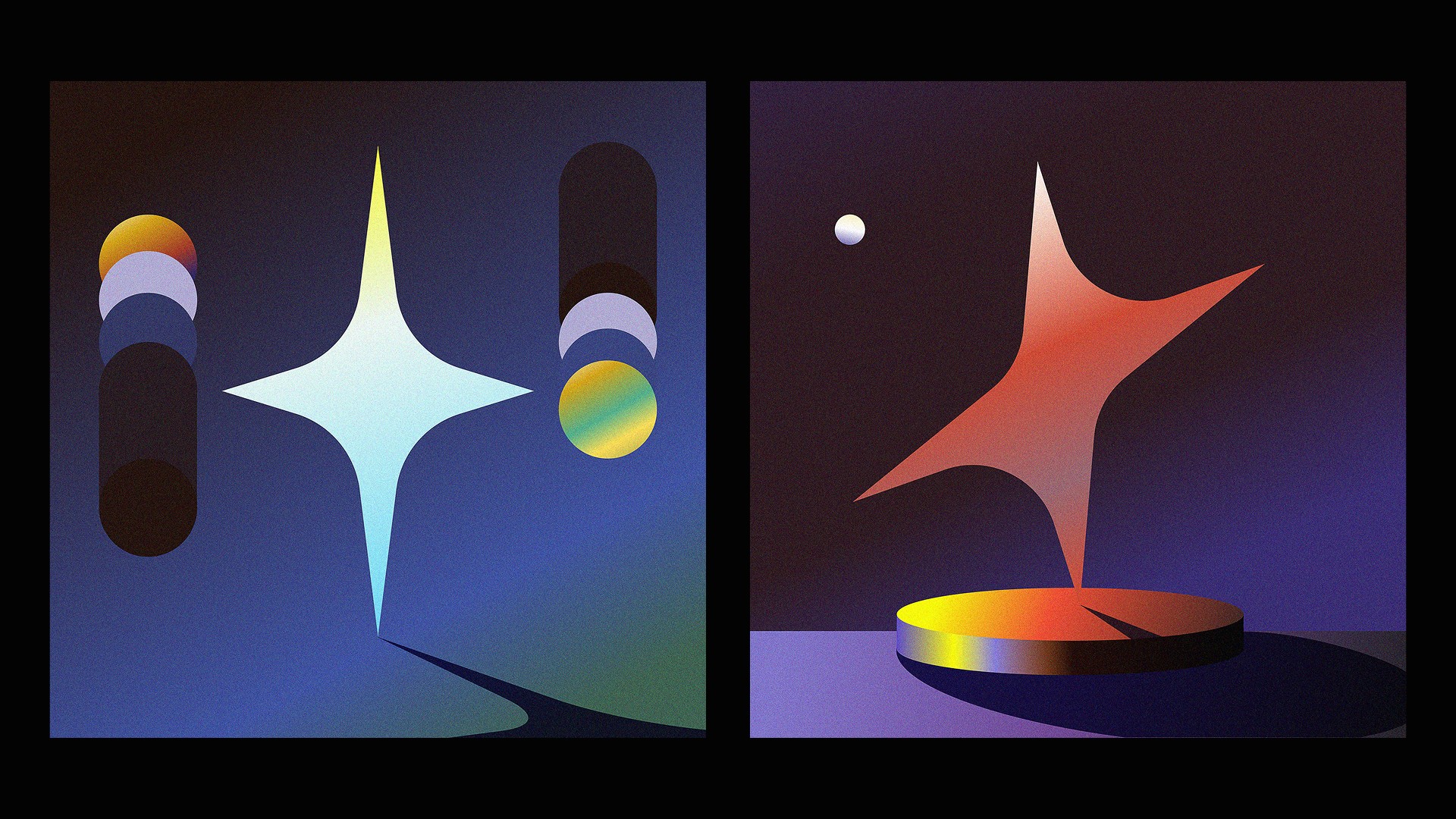
The concept they came with was to utilize the symbol of a star as the main geometric driving force for the overall look.
As a starting point, to concept out other art directions, that fits within the visual world of Lo-Fi.
I was approached by Dontaku Records to do the visual direction for their album cover project.
The concept they came with was to utilize the symbol of a star as the main geometric driving force for the overall look.
As a starting point, to concept out other art directions, that fits within the visual world of Lo-Fi.
I was approached by Dontaku Records to do the visual direction for their album cover project.
The concept they came with was to utilize the symbol of a star as the main geometric driving force for the overall look.
As a starting point, to concept out other art directions, that fits within the visual world of Lo-Fi.

02. Concept
02. Concept
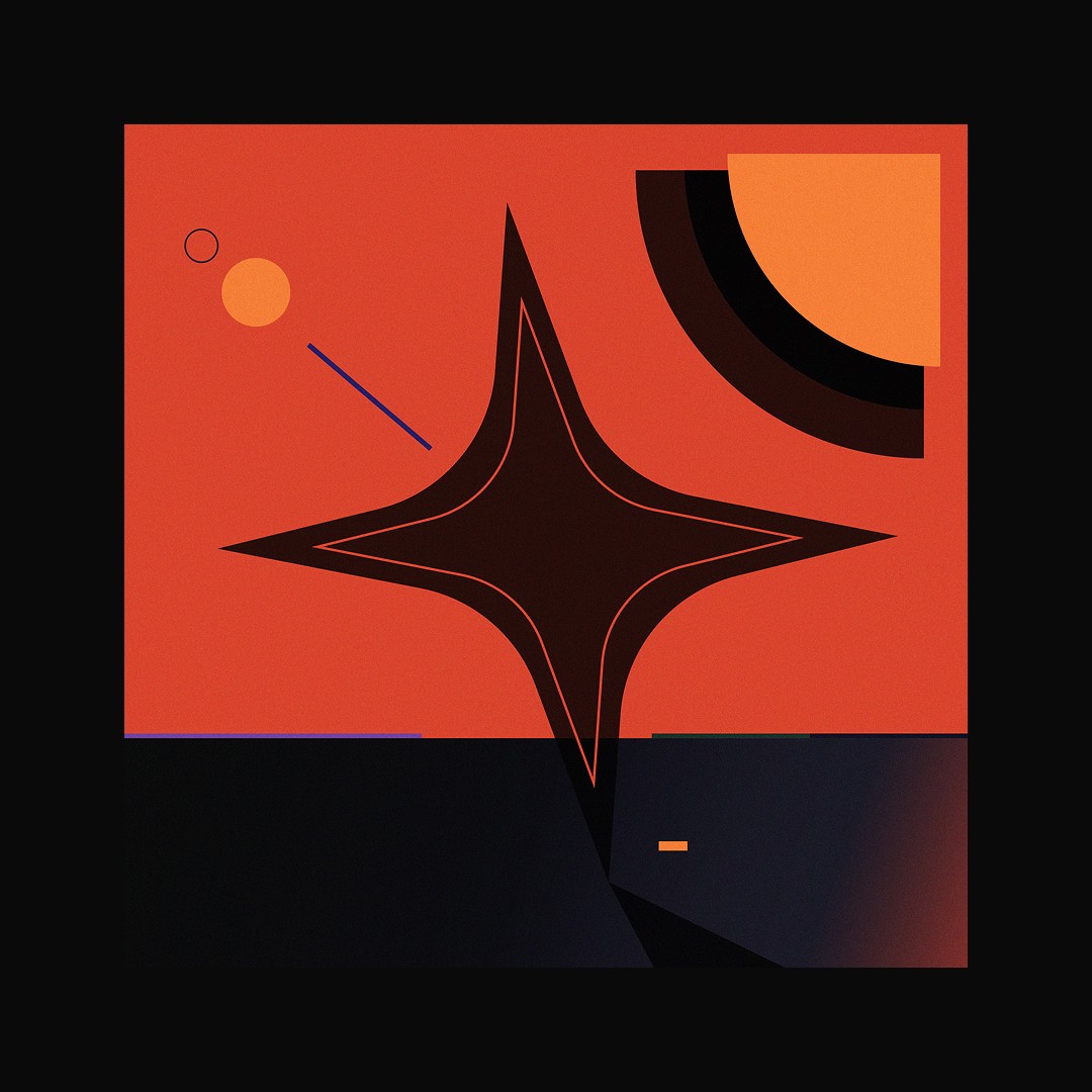
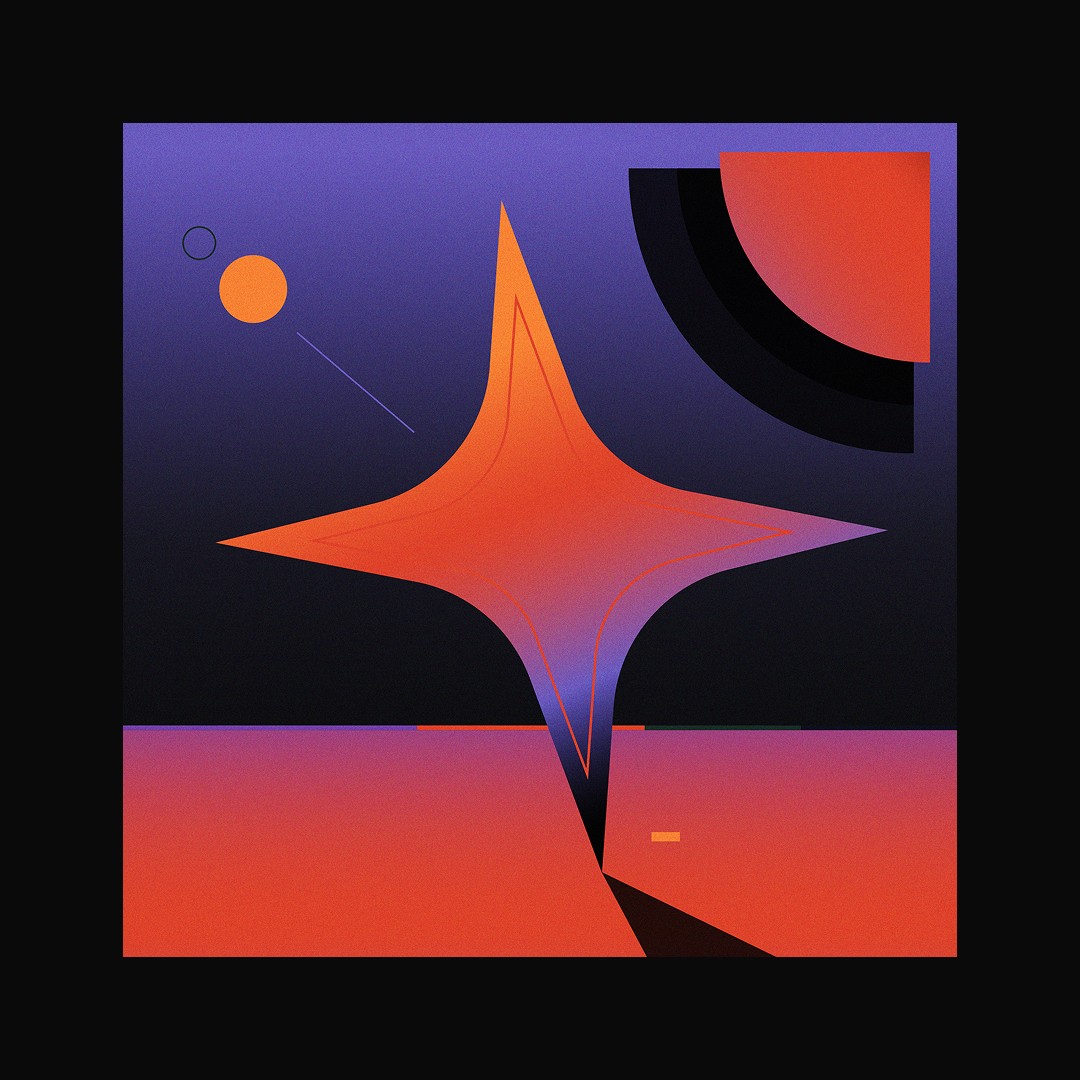
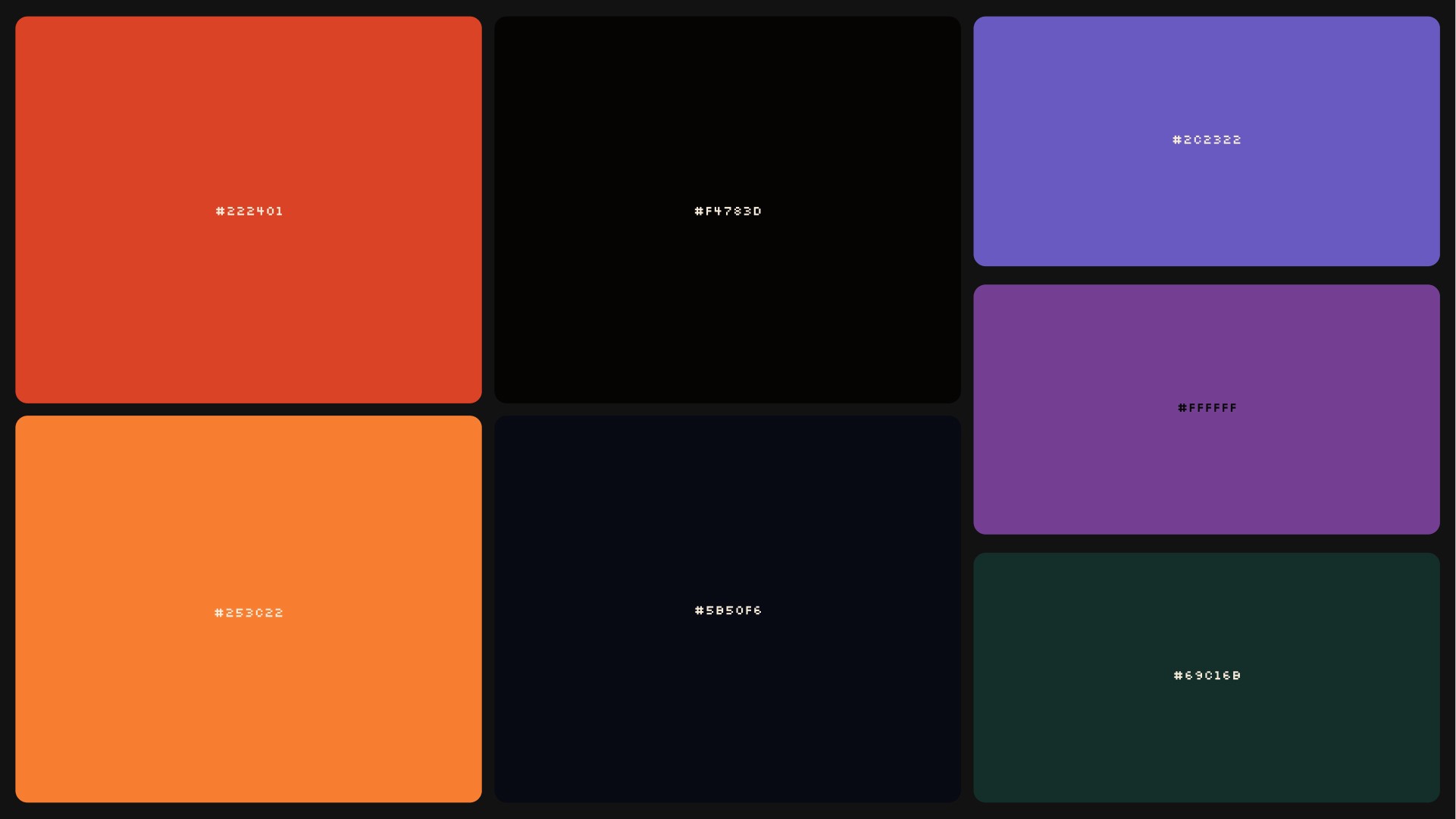
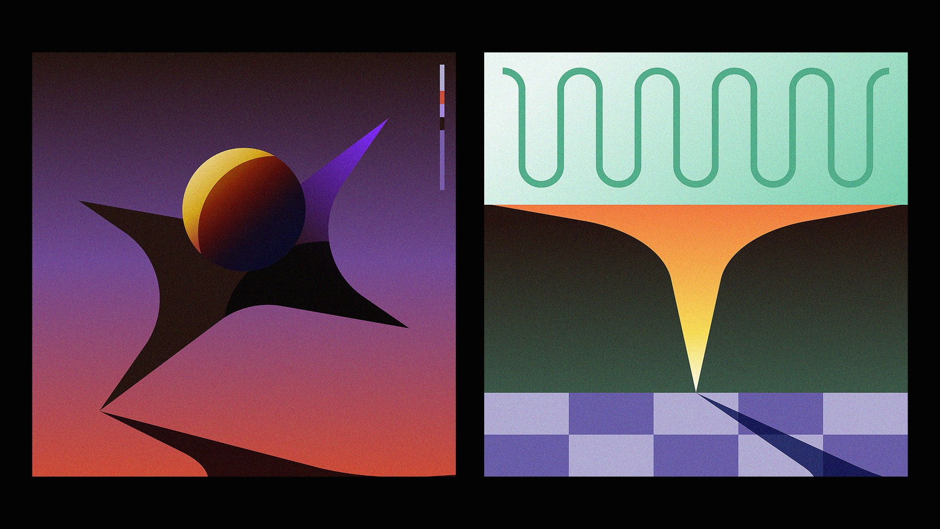
A key focus throughout the visual direction exploration was to maintain a clean, graphic design expressive look & feel, in conjunction with the ambient feeling of afternoon/evening sunlight → think of golden hour sunlight.
A key focus throughout the visual direction exploration was to maintain a clean, graphic design expressive look & feel, in conjunction with the ambient feeling of afternoon/evening sunlight → think of golden hour sunlight.
A key focus throughout the visual direction exploration was to maintain a clean, graphic design expressive look & feel, in conjunction with the ambient feeling of afternoon/evening sunlight → think of golden hour sunlight.
Next Project

14:16:25
every visual work made is done without AI.
For inquires please send a message to
hello@brianhermelijn.com