Project
Eco Cart
Client
Eco Cart
Year
2026
Services
brand identity, art direction,

01. Context
01. Context
We live in a time where everything we eat, buy, and get is either processed or mass-produced. This raised the question: what would a community-driven supermarket look like if it were run under the theme of recirculation especially with printed matter, food, and collaboration with like-minded suppliers?
This raises another issue: how do you tie all of those different nuances into a brand that showcases authenticity while remaining a modern go-to supermarket for people to get what they need?
We live in a time where everything we eat, buy, and get is either processed or mass-produced. This raised the question: what would a community-driven supermarket look like if it were run under the theme of recirculation especially with printed matter, food, and collaboration with like-minded suppliers?
This raises another issue: how do you tie all of those different nuances into a brand that showcases authenticity while remaining a modern go-to supermarket for people to get what they need?
We live in a time where everything we eat, buy, and get is either processed or mass-produced. This raised the question: what would a community-driven supermarket look like if it were run under the theme of recirculation especially with printed matter, food, and collaboration with like-minded suppliers?
This raises another issue: how do you tie all of those different nuances into a brand that showcases authenticity while remaining a modern go-to supermarket for people to get what they need?

02. Concept
02. Concept
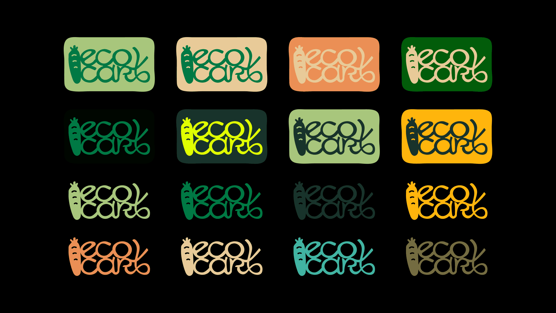
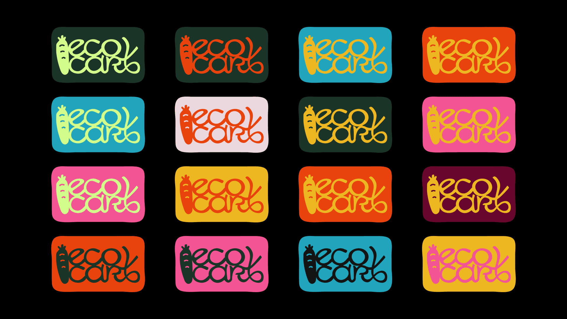
Throughout the exploration, the idea of a hands-on, down-to-earth approach was considered in order to keep the authenticity theme in mind.
Thus, visually, things such as tactility, hand-drawn elements, honesty, and modernity were the themes I kept circling back to in order to tie the brand together, because EcoCart aims to serve conscious shoppers who want to reduce household waste without sacrificing convenience.
Throughout the exploration, the idea of a hands-on, down-to-earth approach was considered in order to keep the authenticity theme in mind.
Thus, visually, things such as tactility, hand-drawn elements, honesty, and modernity were the themes I kept circling back to in order to tie the brand together, because EcoCart aims to serve conscious shoppers who want to reduce household waste without sacrificing convenience.
Throughout the exploration, the idea of a hands-on, down-to-earth approach was considered in order to keep the authenticity theme in mind.
Thus, visually, things such as tactility, hand-drawn elements, honesty, and modernity were the themes I kept circling back to in order to tie the brand together, because EcoCart aims to serve conscious shoppers who want to reduce household waste without sacrificing convenience.


03. Result
03. Result
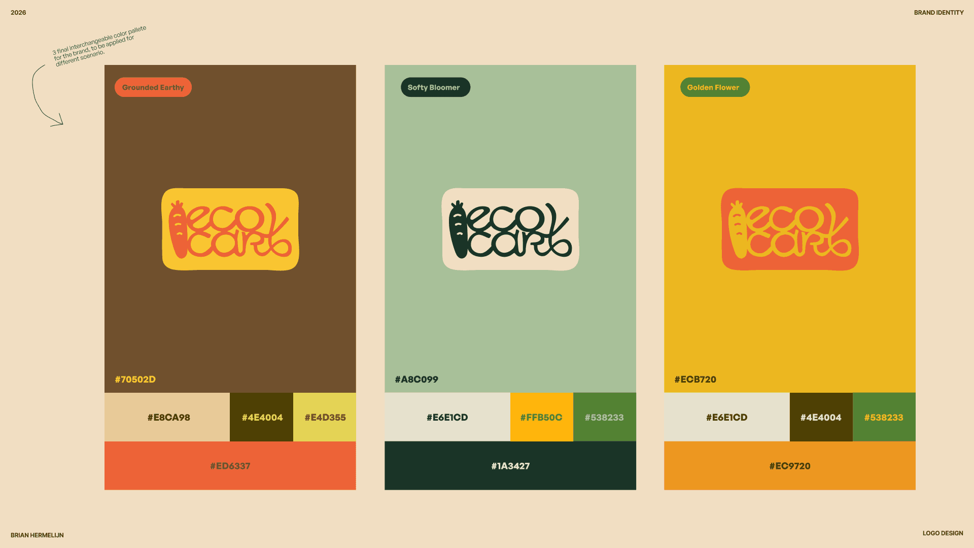
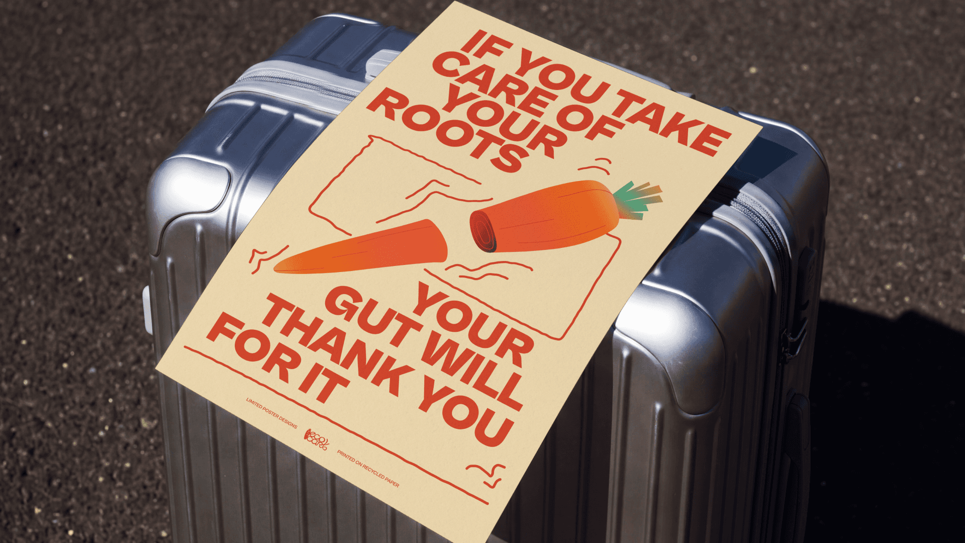
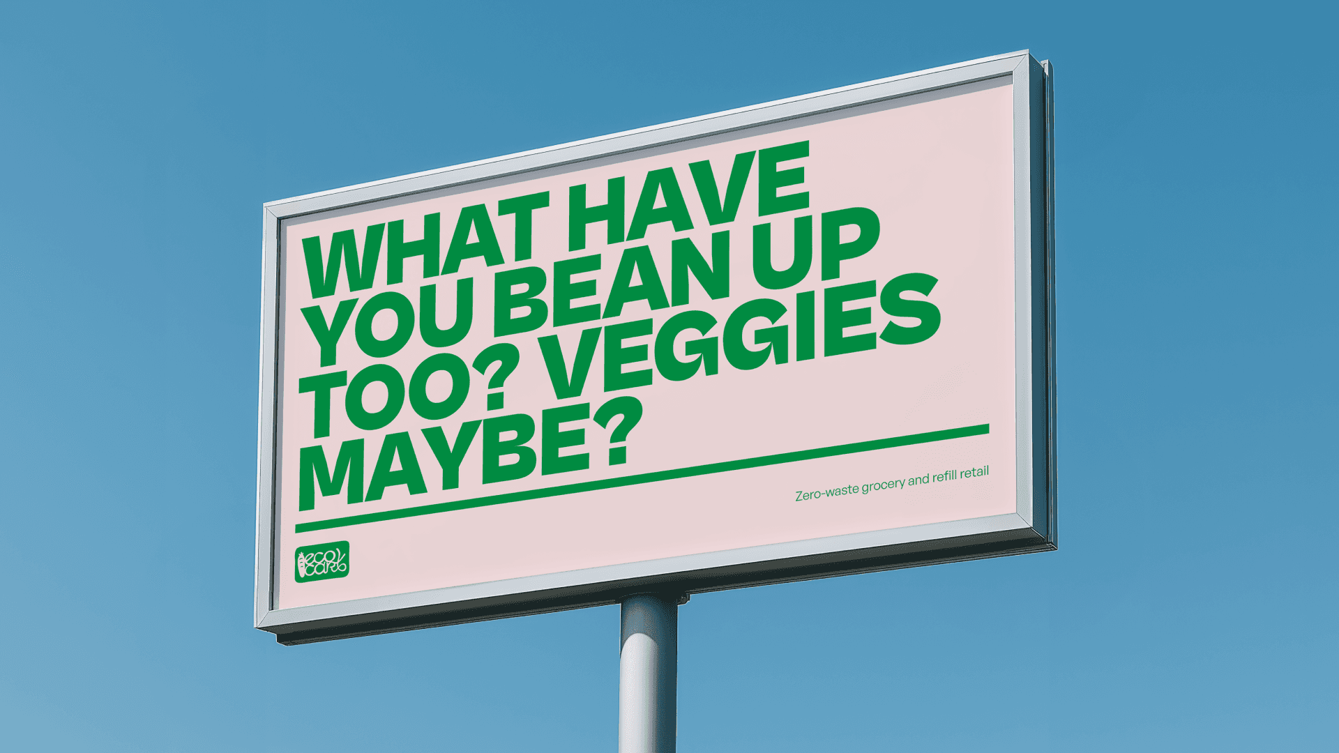
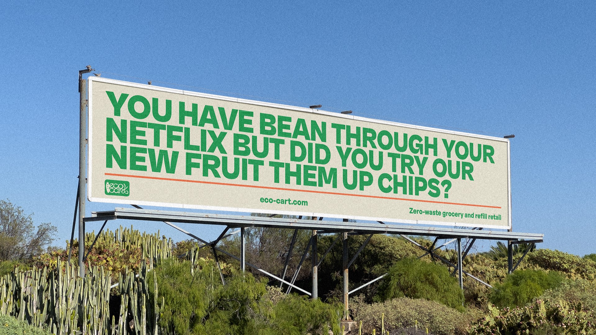
Thus, this resulted in a visual system that ties the brand together through the use of earthy tones for the design assets, an illustration system that can be further expanded as the brand scales up, and various humor-driven copy to bring out the human element.
Thus, this resulted in a visual system that ties the brand together through the use of earthy tones for the design assets, an illustration system that can be further expanded as the brand scales up, and various humor-driven copy to bring out the human element.
Thus, this resulted in a visual system that ties the brand together through the use of earthy tones for the design assets, an illustration system that can be further expanded as the brand scales up, and various humor-driven copy to bring out the human element.





Next Project
13:06:32
every visual work made is done without AI.
For inquires please send a message to
hello@brianhermelijn.com